Slider
Set a value by dragging, with a defined range and step.
CONTROLREQUIRES A TAG
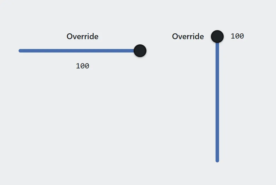
The same slider in both orientations, with the value readout shown.
A slider writes a value to a tag as the operator drags it. The range is fixed by the design rather than typed by the operator, so the value can never leave it.
For exact entry with a keypad, see Number input.
Adding the control
Section titled “Adding the control”- Open the document and select the screen you want from the screen tabs.
- In the control palette, press Slider and drag it onto the canvas.
- Bind it to a tag, then set the range and step.
A horizontal slider cannot be narrower than 144 px, and a vertical one cannot be shorter than 144 px.
Properties
Section titled “Properties”| Property | Description | Default |
|---|---|---|
| Label | Text shown above the control. | none |
| Tag | The value read and written. | none |
| Min / Max | The ends of the range. | 0 / 100 |
| Step | Granularity of a drag. | 1 |
| Decimals | Digits after the decimal point in the readout. | 0 |
| Orientation | Horizontal or vertical. | horizontal |
| Show value | Display the current number alongside the track. | on |
| Unit | Suffix shown after the number. | none |
| Size | Text size in pixels. | 14 |
| Track / Fill / Thumb / Text colors | Appearance. | theme tokens |
Step and range
Section titled “Step and range”Step is what a drag snaps to. A step that does not divide the range evenly leaves the top of the range unreachable.
Related
Section titled “Related”- Number input — for exact entry with a keypad.
- Gauge — to display a value without allowing changes.
- Tags — naming the register a slider writes to.