Label
Static or state-driven text, with optional border and underline.
A label puts text on a screen. That text can be fixed, can interpolate live tag values, or can change entirely with machine state.
It is display-only — it never writes, and it cannot be pressed — so it is the control to reach for when a screen needs to say something rather than do something.
Adding the control
Section titled “Adding the control”- Open the document and select the screen you want from the screen tabs.
- In the control palette, press Label and drag it onto the canvas.
- Type the text. To show a live value, insert a tag with the Tag button,
which writes
{tag_name}at the cursor.
Being display-only, a label is not held to the 96 × 48 px floor that controls an operator aims at must respect. A one-line status label can be as small as the grid allows.
Properties
Section titled “Properties”| Property | Description | Default |
|---|---|---|
| Text | The text shown. {tag_name} interpolates a live value. |
Label |
| Color | Text color. | base content |
| Size | Text size in pixels. | 18 |
| Bold | Semibold text. | off |
| Underline | Underline the text. | off |
| Align | Horizontal alignment. | center |
| Wrap | Let long text run onto more than one line. | off |
| States | Conditions that replace the text and color. | none |
| Border | Color, width, corner radius and padding of a box around the label. | off |
Showing a live value
Section titled “Showing a live value”A tag name in braces is replaced by that tag’s current value. The Tag button beside the field inserts one at the cursor — worth using on the pendant, where braces are two pages deep on the keyboard.
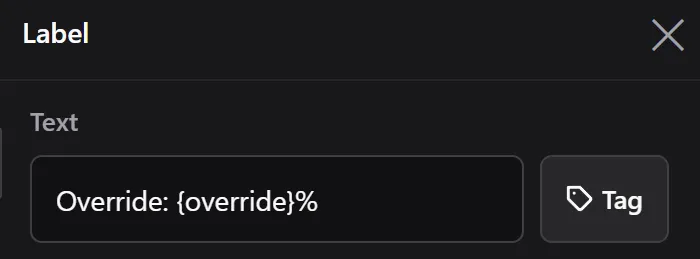
What you type.
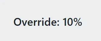
What the operator sees.
A number can be given a fixed number of decimals with : and a digit:
{speed:1} shows 42.6. The date and time have their own formats:
{date | "MM/dd/yyyy"}. See System values.
States
Section titled “States”Like an Indicator, a label can carry states: each has a condition, its own text and its own color, and the first true one wins. Where an indicator shows a fixed vocabulary of states, a label is the better choice when the text itself is the information.
A state with an empty condition never matches, and the editor warns about it. The default text is the fallback when no state matches.
Border and padding
Section titled “Border and padding”A border draws a box around the label — color, width, corner radius — with padding between the text and that box. Padding applies to the sides of a single-line label: before left-aligned text, after right-aligned, symmetric when centered. When the label wraps, it applies to all four sides.
A Rectangle behind a label can also draw a box, but a border keeps its spacing exact and moves with the label.
Related
Section titled “Related”- Tags — the values a label interpolates.
- Expressions — the syntax used by state conditions.
- Indicator — for a state shown as a colored panel.