Button
Momentary, toggle and action buttons, and what each one writes.
Twelve buttons, one control: every pattern on this page, shown on the pendant.
A button runs one or more actions when it is pressed, and optionally another set
when it is released. That pairing is what makes the default button momentary:
out of the box it writes true to a tag on press and false on release, which
is the behavior of a physical pushbutton.
A button also has a lit state, drawn from the machine rather than from the press. A button that has been pressed does not light because it was pressed; it lights because the signal it commands came back on.
Adding the control
Section titled “Adding the control”- Open the document and select the screen you want from the screen tabs.
- In the control palette, press Button and drag it onto the canvas.
- With the button selected, set what it does under On press in the Inspector. A new button starts with a write action whose tag is unset.
A button cannot be resized below 96 × 48 px.
Properties
Section titled “Properties”| Property | Description | Default |
|---|---|---|
| Text | The label. Enter starts a new line. May be empty if the button carries an icon. | Button |
| Size | Label size in pixels. | 15 |
| Bold | Semibold label; off is regular weight. | on |
| Align | Horizontal label alignment. | center |
| Icon | Optional glyph before the label, or alone when the text is empty. | none |
| Variant | Theme color for the button. One of primary, secondary, accent, info, success, warning, error, neutral, ghost, or custom. | primary |
| On press | Actions that fire when the button is pressed. | write true |
| On release | Actions that fire when it is released. | write false |
| Lit expression | Expression that decides when the button reads as lit. | lit while pressed |
| Lit text | Alternative label shown only while the button is lit. | same as Text |
| Flash while lit | Pulse the lit color to pull an operator’s eye, at a slow or fast rate. | off |
| Disabled expression | Expression that, when true, grays the button out and stops it responding. | never |
| Confirmation | Require a second press in a modal before any action fires. | off |
Choosing custom for Variant exposes the unlit and lit fill and text colors directly. Every other variant takes its color from the theme, so a document that changes theme keeps its buttons consistent.
Actions
Section titled “Actions”Both On press and On release hold a list, and the list runs in order. The action picker groups them:
Machine — write a value to a tag, toggle a tag, run a program, run a program in the background, select a program, reset faults, pause, or abort.
Screen & UI — navigate to another screen, show alarm history, show the runtime log, or show diagnostics. On a prompt, Answer prompt replaces navigate: it closes the prompt and hands a number back to the robot program.
Data — call an HTTP endpoint and map fields of the response back onto tags, or back up the controller to a USB stick.
Lit state
Section titled “Lit state”Leave Lit expression empty and the button is lit only while it is held, like a momentary pushbutton.
To make it follow a signal, enter that signal’s tag: {clamp} keeps a Clamp
button lit while the output it toggles is on. The expression need not name the
tag the button writes. A Start button might write to a request signal but
light only once the robot is actually running, which is an expression over a
different tag.
What lit looks like
Section titled “What lit looks like”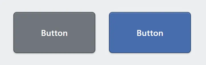
One button with the custom variant, in both states: unlit on the left, lit on the right.
Every variant except ghost uses the same color lit and unlit, so on those a lit button shows only as a highlight glow around its edge. Ghost is transparent at rest and tinted when lit.
For a button that changes color — gray at rest, green when running, the classic pushbutton — set Variant to custom, which exposes the unlit and lit fills separately.
Flash while lit also depends on this expression: a button flashes only while it is lit, so on a button with no lit expression it pulses only while held.
Two-state text
Section titled “Two-state text”A button whose two states read differently — START/STOP, OPEN/CLOSE — sets Lit text. It is shown only while the button is lit; leave it empty and the button keeps one label throughout.
Confirmations and the event log always use the plain Text, so the button has one name whichever state it is in.
Confirmation
Section titled “Confirmation”Turning on Require confirmation before actions fire puts a modal in front of
the button. Neither On press nor On release runs until the operator confirms,
and the confirmation message is written by you. Validation reports a confirmation
whose message is blank.
Running a program in the background
Section titled “Running a program in the background”Run program in background is different from the Run program action. Run program
aborts whatever is running and selects the program first, prompting the user if
necessary. The background one does none of that. It just makes sure that the program
you’ve selected uses the *,*,*,*,*,*,*,* group mask (no motion groups).
Related
Section titled “Related”- Tags — naming the signals a button writes to.
- Expressions — the syntax used by lit and disabled expressions.
- Program control — Start, Hold, Reset and Abort as one control, with no tags to declare.